Loca
This project was a UX design case study focused on improving safety for people who run when it is dark outside.
Team Members: Lydia Burns, Dipti Gupte, Lakshmi Seelam
My Role: Project Manager, Interaction Designer
Duration: August 2022 - December 2022
Overview
Loca is a wearable concept and an accompanying app design for users who run in the dark. The wearable is a bracelet that alerts the user to changing safety factor densities along their route and serves as a tool that the user presses at specified checkpoints to alert a preselected, remote companion of their safety. The app is a means for the companion to monitor a runner along their checkpoints and a way for the runner to track their running activity so that they can continue to run safely in the dark.
Background

Many runners choose to run when it is dark outside either out of preference or out of necessity due to demanding schedules. However, there is another subset of runners that would prefer to run in the early morning or evening in order to balance their busy schedules, but choose not to out of fear of their safety. Our team has identified two main threats to runners when it is dark outside: crime and traffic. In both of these harm scenarios, the runner is more vulnerable when it is dark outside. These safety concerns are further amplified when there is a low density of safety factors along the running route. Safety factors include conditions such as lighting, proximity to open businesses, density of people, and others. The goal of our project was to leverage these safety factors in a tool that allows runners to confidently run in the dark, so that they can have more freetime during the day.
Problem Space
User Group
Young adults (college-aged)
People who live in or near a city in the US
People who often run at times when the sun isn’t out
User Characteristics
Users are multitasking
Users are conscious of their environment
Users are focused on completing their run
Users value a sense of companionship
User Goals
1. To feel safer when running in the dark
2. To know more about the environment of their route before going on it
3. To not have to be as concerned with safety so they can fully focus on completing their run.
User Research
Surveys
A survey was distributed and filled out by over 100 young college-aged adults with the goal of gaining a fundamental understanding of our problem space.
Cultural Probes
We asked 20 individuals who run/walk when it is dark outside to draw a scene of a pitstop that they would feel comfortable stopping at during their walk/run.
Interviews
We conducted two semi-structured interviews to obtain qualitative data from our user group. From these interviews, we collected insights that were used to create an affinity map.
Research Findings

Word cloud produced from the results of our cultural probe based on what the participants drew as a comfortable running environment.
49% of people ranking street lights as the number one safety factor.
Users want to run or walk in places that are nearby open businesses with a high density of people
46% of participants claimed that concern for their safety prohibits them from running when it is dark outside.
Design Requirements
-
Users are given information about density of safety factors of their route
Design should have a balance between customization for users and rooting the information in facts
User’s location data is kept private
Users feel a sense of companionship during their run
-
Users feel a stronger sense of safety during their run/walk in the dark
Design is familiar to existing systems to make it easier for the user to learn
Design is accessible and usable by people of differing identities and abilities
Ideation
During our first design ideation session, we practiced the “yes, and” method to rattle off any and all ideas with one team member taking notes. These ideas came from what we had learned about our user group from the survey results and cultural probe responses.
After completing two semi-structured interviews, we created an affinity map and walked the wall. We then came back together and conducted a session of Crazy Eights in Miro where we came up with a new set of ideas inspired by our walk the wall session as well as further data analysis. These ideas were added to our initial design ideas to begin our categorizing and voting process. From there, we organized similar ideas and wrote down the main ideas of each category and voted on the ideas we liked the best. After assessing how each idea addressed our design requirements, we decided to move forward with Loca, the wearable bracelet and accompanying mobile app.
Design Concept
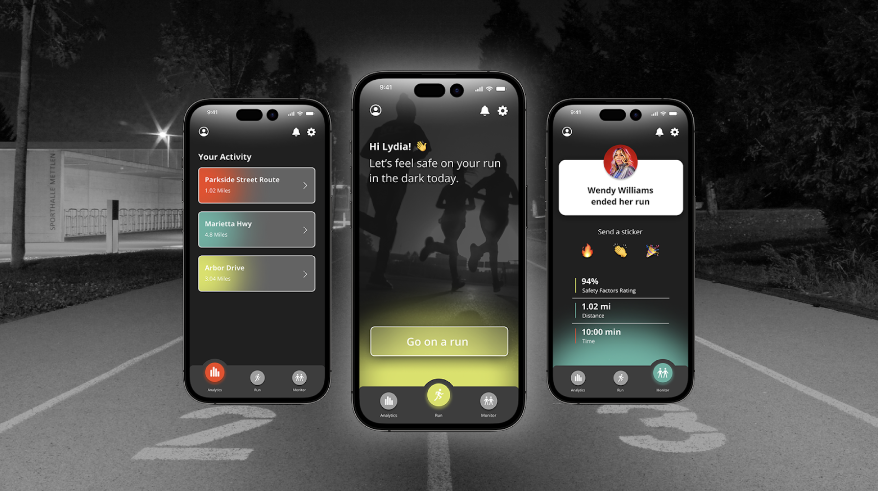
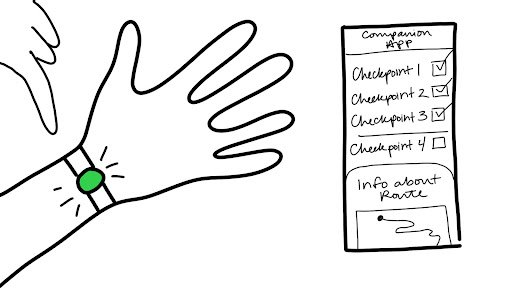
Loca is a wearable concept and accompanying app aimed at providing companionship and a feeling of safety while on a run in the dark. Loca is short for “location” because it allows solo runners to exercise confidently in the dark, knowing their location is being shared with a designated remote companion. There would be a series of checkpoints throughout the user’s run where they are required to push a button that indicates they are still completing their run and are able to do so safely. The user has the option to receive checkpoints based on time or mileage. They would be alerted that it is time to check-in with a combination of two prompts; their bracelet would start flashing a white light and the button would vibrate against their wrist. Should the user not check in, their monitoring companion would be alerted with the option to call emergency services.
Additionally, during different portions of the run, the bracelet will glow different colors. When the user is in an area with a high density of safety factors, the bracelet will be green. The bracelet will be red when the user is in an area with a low density of safety factors and will alert the user to be more aware of their surroundings.
We designed a prototype of the accompanying mobile application that would be used by both the runner and the chosen companion.

Design System


Final Prototype
Each of us participated in the process of iterating on the design, which led us to our final prototype. I took the lead on working on interaction design. The prototype, made in Figma, is shown here. You can click to interact with the prototype.
Prototype Walkthrough
Prototype Evaluation
We conducted a discount evaluation with other students in our class using a cognitive walkthrough and a heuristic evaluation. We evaluated the effectiveness of our design by assessing whether it successfully addressed three main design requirements.

Design Requirement: Users feel a stronger sense of safety during their run in the dark
✅ Users said the app would provide a feeling of adequate safety
✅ Users affirmed that the app is simple and intuitive
❎ Users wanted there to be some sort of indication that their companion is actively monitoring their run
Design Requirement: Users feel a stronger sense of companionship during their run
✅ Users said that they would feel a sense of companionship when their companion actively monitors their run
✅ Users appreciated the feature that allows the companion to send a sticker to the runner at the conclusion of their run
Design Requirement: Design should have a balance between customization for users and rooting the information in facts
✅ Users agreed that the safety factors driving the app’s algorithm would avoid racial bias/discrimination to influence the app
✅ Users enjoyed that the settings allowed them to customize how they would receive bracelet notifications and set up their checkpoints
❎ Users said that the app should have more information about how the safety factor ratings and hierarchy are determined