AV Accessibility
This project was a UX research-based case study focused on increasing the comfort of autonomous vehicles for people with Autism Spectrum Disorder.
Team Members: Lydia Burns, Dipti Gupte, Lakshmi Seelam
My Role: Lead Researcher
Duration: August 2022 - December 2022

Overview
The availability of autonomous vehicles is a growing industry with great promise to aid individuals who are unable to drive or access public transportation. Only one in three teens with Autism Spectrum Disorder (ASD) obtain a driver’s license at a rate of 9.2 months later than their typically developing peers. As transportation presents a major barrier to independence for individuals with ASD, autonomous vehicles afford a unique opportunity to alleviate this pain point for people with ASD. However, many individuals with ASD experience anxiety in regular vehicles, let alone autonomous ones. Because of this, we strived to design a system that would make the experience inside of autonomous vehicles more comfortable for individuals with ASD. After conducting interviews receiving feedback, we designed a conversational voice assistant and customizable notification system that can be integrated into any autonomous vehicle dashboard.

User Research
Surveys: People with ASD & Parents/Caregivers
4 User Interviews: People with ASD & Parents/Caregivers
2 Stakeholder Interviews: Behavior Analyst and Cruise Staff Analyst
After conducting the above research methods, we took away three main topics for our research findings:
Problems with Current Transportation Methods
Current Attitudes on AVs
Preferences in Comfortability

Affinity Maps

User afffinity map based on insights collected from interviews with people who have ASD.

Stakeholder affinity map based on insights collected from interviews with parents of people with ASD.
From our research, we collected insights through affinity mapping in order to come up with the following design requirements:
User needs a way to calm down or have a distraction from anxiety induced by being in a car/AV
User wants a sense of ownership
User likes to follow a set routine
Parent/Caregiver would like a way to know user chose the correct route or made it to their destination
Design Concept: Communication Assistant Dashboard UI
We created multiple digital sketches of functions that would address our design themes. From there, we held user feedback sessions to hear the parts of our ideas that the users liked and what could be improved. Based on their answers, we updated our design concepts through the creation of a wireframe.

The wireframe (right) outlines the experience that the user will have while they are inside of the autonomous vehicle. On the left side of the screen is the map view. Here the user is able to see the progress of their ride along with the navigation details that disclose information about the vehicle’s upcoming turns and movements. On the right side of the screen is the communication center. This side always allows the user to see a transcription of the voice assistant and the conversation, trivia, or other calming activities will appear on this side of the screen. After conducting more user interviews to gain feedback on these wireframes, we designed our prototype based on the users’ preferences.

Design Solution

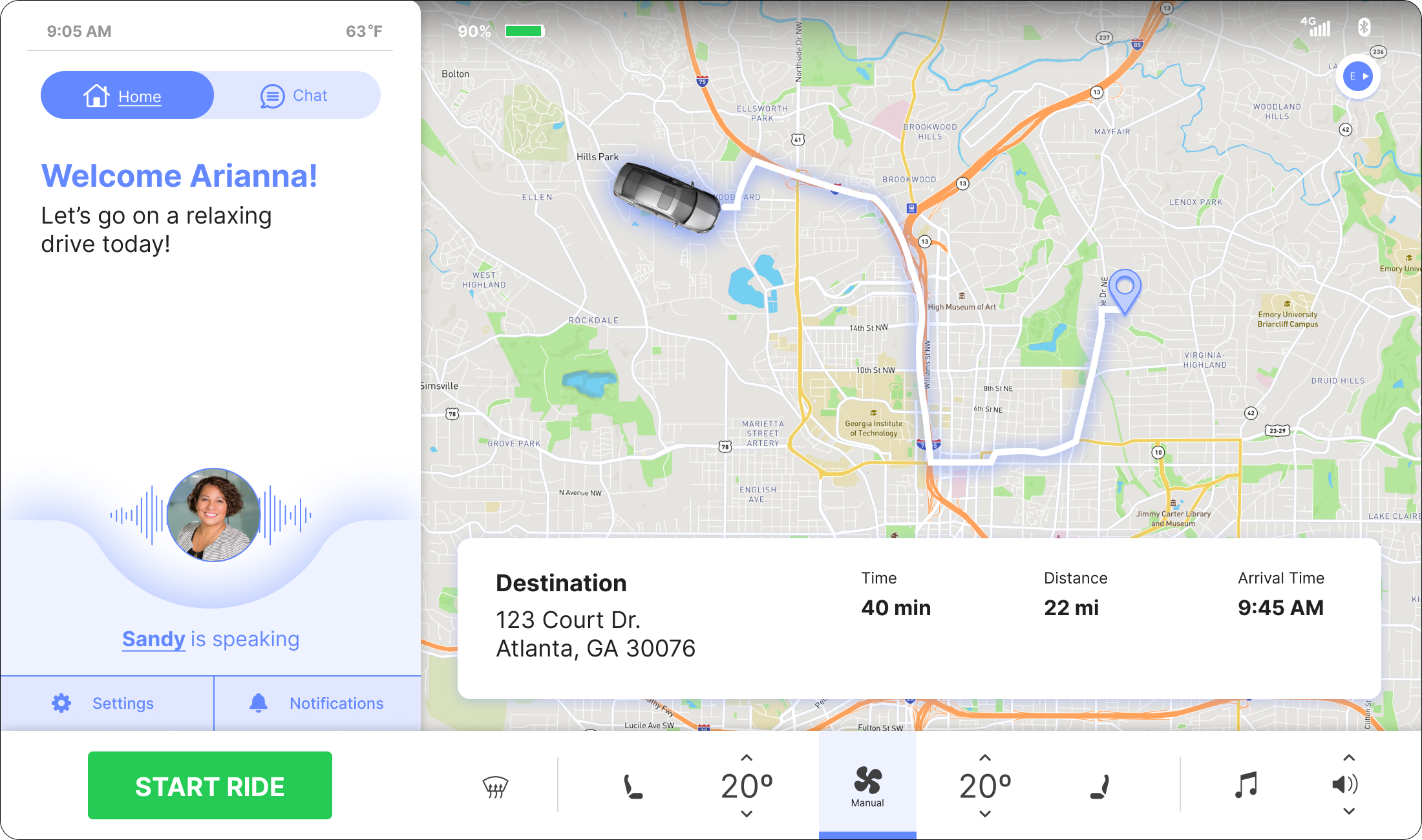
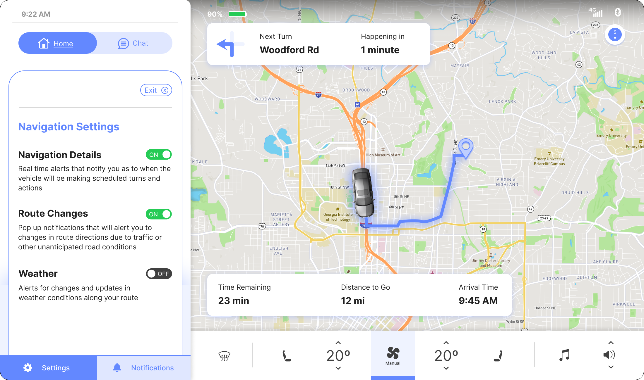
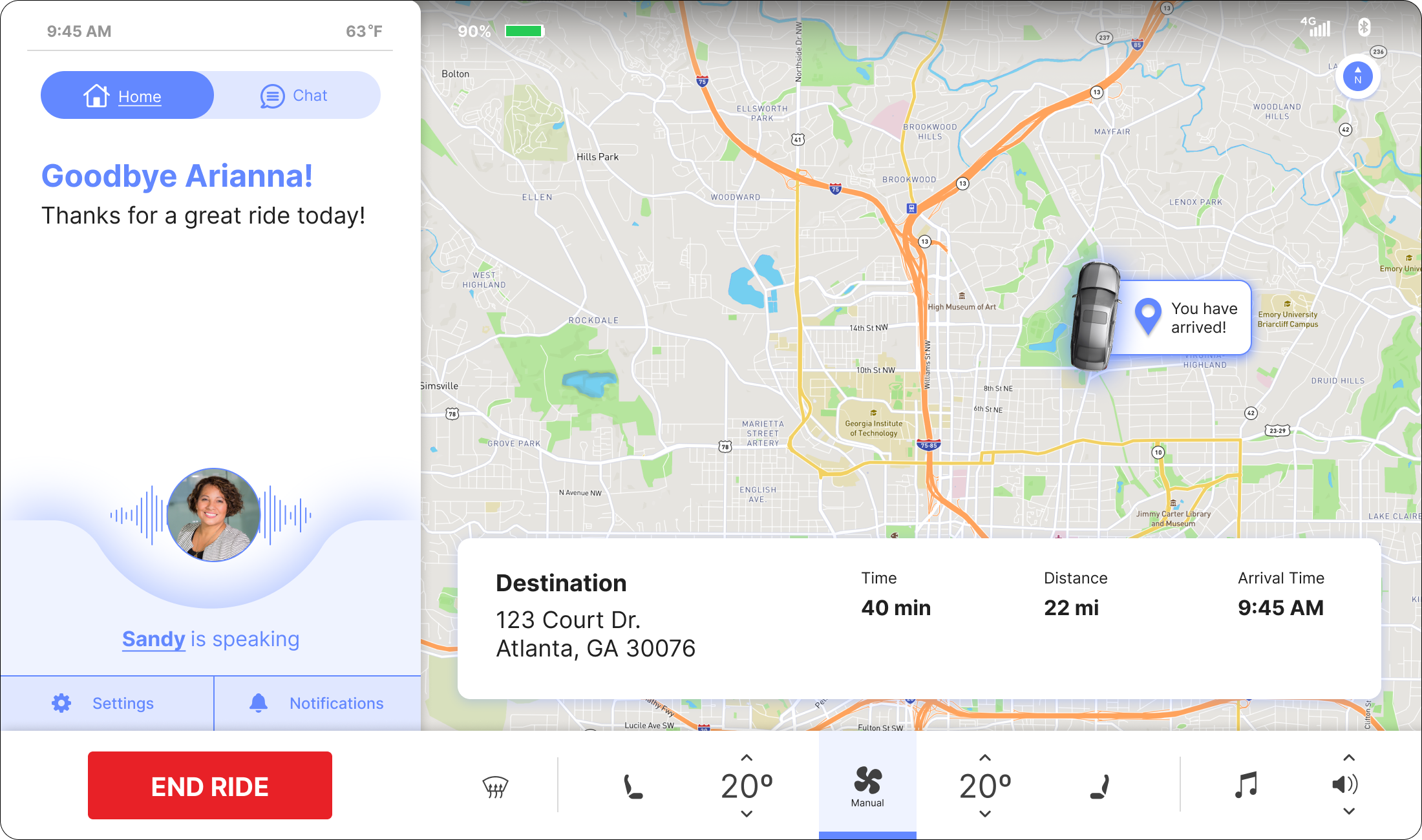
Our prototype solution is an autonomous vehicle dashboard interface for a communication simulator and customizable notification feature. During all of the interactions, a voice assistant, named Sandy, will speak to and guide the user through their journey within the app. Our vision is that our product would function as assistive technology in that it could be overlaid on top of any car dashboard display. Throughout the ride, the user is having a “chat” or answering questions prompted by the voice assistant; they can also monitor their route, ride silently, receive notifications, and change the settings of their notifications. All of these features work to create the most comfortable and customizable experience as possible to people with Autism riding inside of an autonomous vehicle. Our app lives on the left side of the screen and has pop-up cards with directions and ride information that overlay atop the map.
Communication Simulator
Customizable Notifications Feature
Prototype Walkthrough
Here is a video walkthrough of our prototype, conducted by my teammate Lydia Burns.
Prototype Evaluation
In order to evaluate the effectiveness and ease of use of our prototype, we utilized the following evaluation methods:
Cognitive Walkthrough
Heuristic Evaluations
Usability Testing Sessions

Evaluation Results
84.5%

task completion rate across usability testing participants.
We asked users to rate a variety of statements on their feelings when using the voice assistant feature on a scale of 1 to 5, 1 being Not Likely at all and 5 being Very Likely. The results are displayed in the chart to the left.


